Here’s a glimpse into the way my brain worked when I was asked to pitch for the new identity for Highland Council, back in 1995. Below you’ll see the brief itself and how my logo developed from a map of the region into a corporate identity.
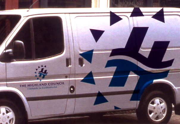
This solution was liked by the Council, but was not chosen, one reason being, allegedly, we were not based in the Highland region. Instead they adopted the logo shown at the bottom of the page.


Step 1: Take map and simplify the shapes. Turquoise chosen to represent the colour of the Highland landscape.

Step 2: Develop shapes towards the letter H.

Step 3: Add a wave and the second colour, blue, to represent water and the significant roll it plays in the Highlands, in terms of power generation, environment, tourism, etc. I also saw this horizontal wave as a link across the entire Highlands, its people, communication and transport. To me, it also looks a bit like two people embracing, meeting or dancing.

NB. At this point, the symbol is symmetrical through 180 degrees.

Step 4: Eight triangles are added to represent the eight area committees and to introduce the letter C for Council.

Step 5: Add the name and Gaelic in a suitable corporate typeface – Optima – centred below the symbol.

Step 6: Show how the 2-colour identity will be applied to all stationery, b/w adverts, 2-colour leaflets, full colour brochures, signage, uniform, t-shirts, livery and merchandising.


Below is the actual Highland Council identity.
