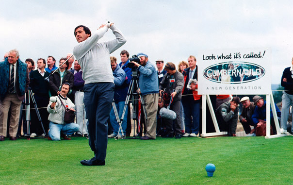
Around the Boardroom table in the late 1980s, we sat for hours developing our campaign for Cumbernauld Development Corporation. Robert Beedham summed up that what we have is a place where many multinational companies had recently located, a new town that was rejuvenated, where many families had moved to and enjoyed living, a town with an excellent location in the centre of Scotland, boasted a new golf course designed by Seve Ballesteros, and all we had to do was tell people what it’s called – Cumbernauld. ‘That’s it!” says Jim Greig. “What’s it? says us. “What’s it called? – Cumbernauld” exclaims Jim. And the rest is history, as they say.
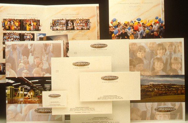
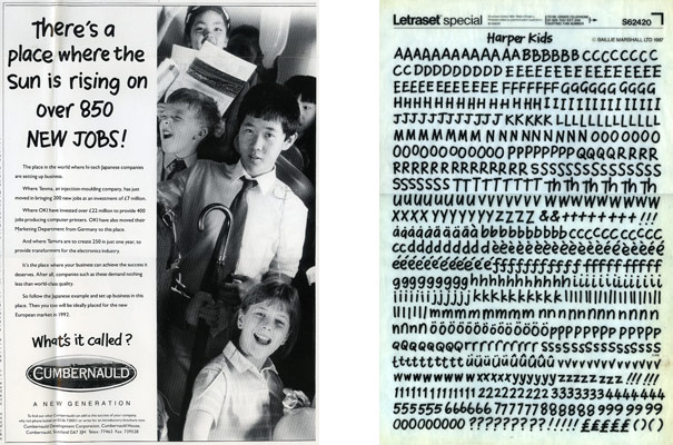
This won us the advertising account and, over the next few years, we developed all their advertising and marketing material – everything from their new identity and brochures to their press, 48-sheet poster, TV and radio advertising. Our byline – A New Generation – highlighted both the fact that there was new impetus and determination within the town and the fact that, being a 1960s new town, a new generation of Cumbernauld kids was now growing up in the town. Hence our use of kids in place of adults in all media and the creation of the typeface ‘Harper Kids’ for use on headlines.

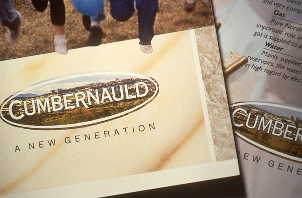
I created the new logo as an oval window, looking through into different aspects of the new town, like industry, architecture, sport and people. Fellow designer, Tony Brown, designed the brochures in which the children feature. Top left above, for instance, you’ll see graphs represented by differing numbers of children. The top right cover features a still from the TV commercial, with the children running through a field, on the south side of … what’s it called?


