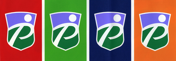
On 2 June 1998, the brief to design a corporate identity for the newly-formed Scottish Premier League landed on my desk. However, it was to be a pitch – a football pitch? – against other agencies and that was to be in ten, yes ten, days time!
I’d created the Scottish Rugby logo in 1991 and the Scottish Golf logo in 1997. I was going for the treble!
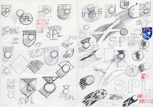
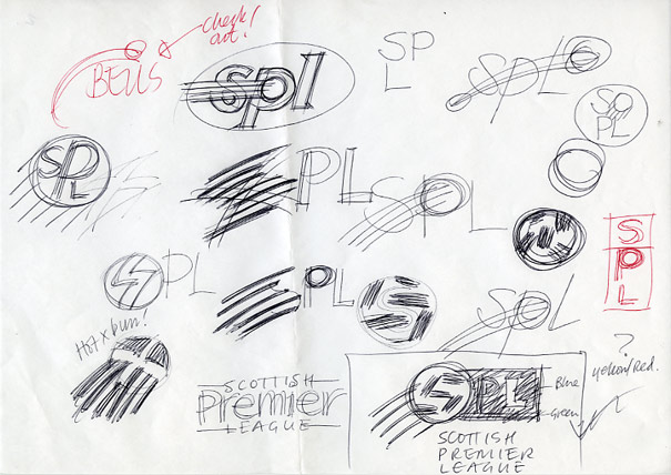
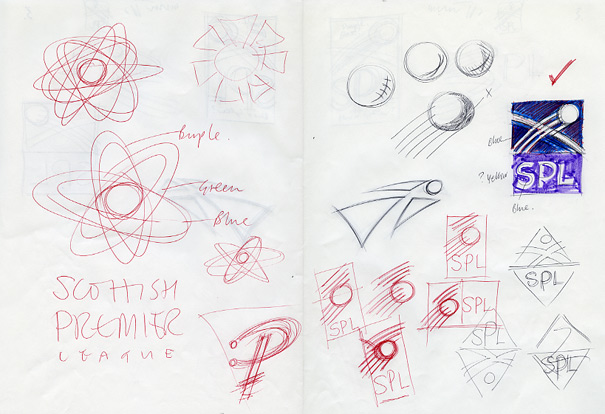
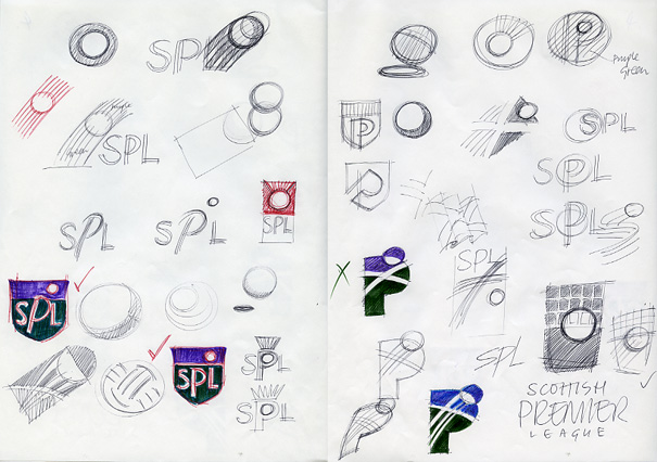
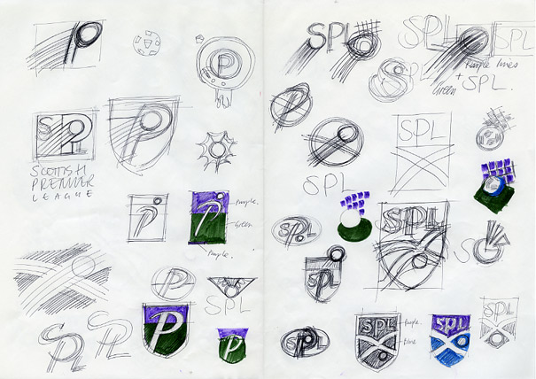
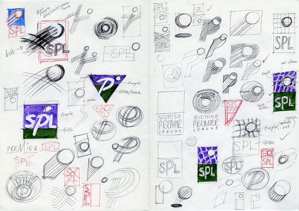
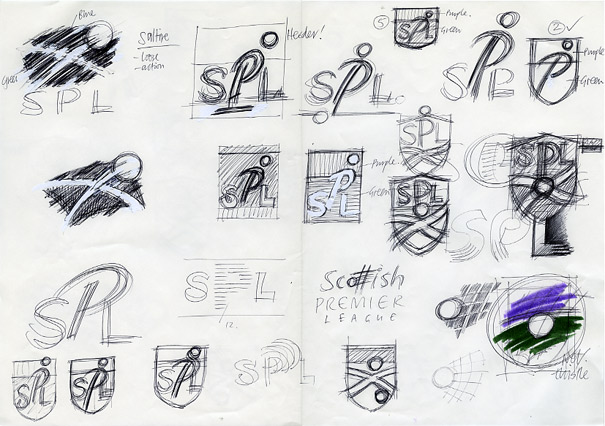
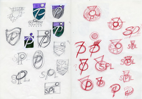
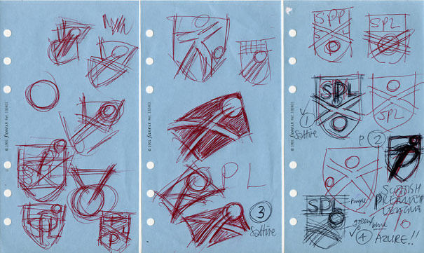
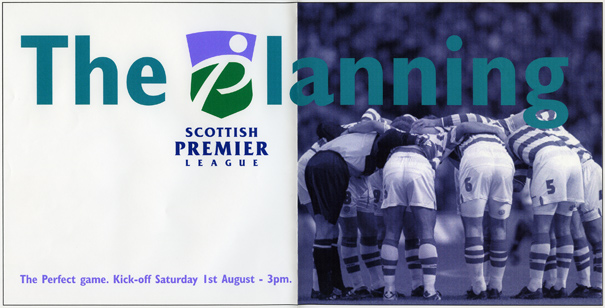
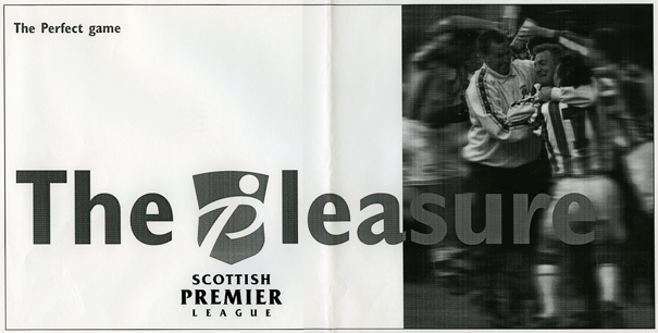
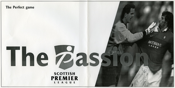
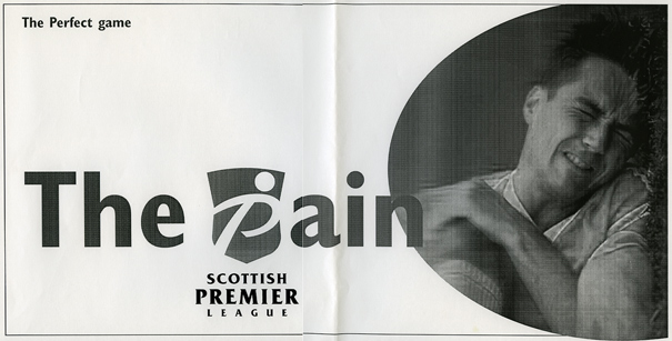
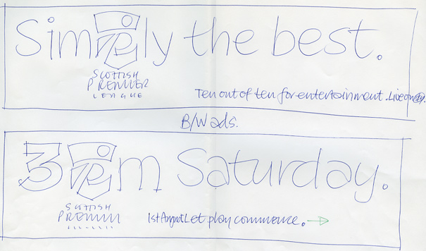
Just how much I wanted it is reflected in the numbers of rough ideas, shown below, that I came up with in the next few days. Usually I’m more comfortable presenting several design solutions to a client, if only to show that I can up with more than one idea! However, after whittling these down to four favourites, I was so positive about my preferred option that only this single logo was taken to final artwork and a marketing campaign developed around it.
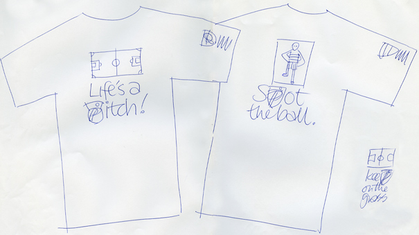
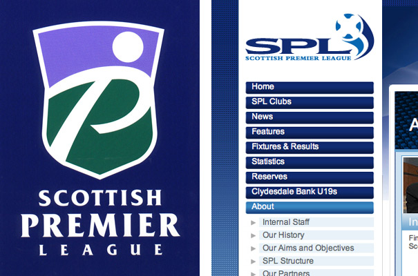
In my presentation rationale, I suggested that the X of the saltire had been discounted as it could be seen as a negative symbol or, in football terms, as a draw. Sod’s Law, that’s what they chose. Yes, life’s a pitch and I’ve got the T-shirt!
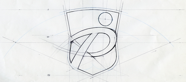
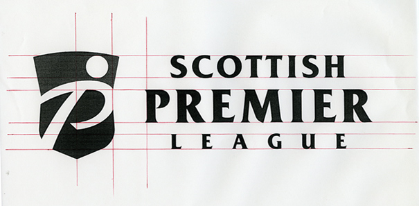
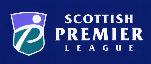
My P(for Premier)-shaped football player within a thistle-shaped shield was resigned to the bench, but I still think he’s got fresh legs.
