These ice cream packs were only two of the hundreds of food packs I must have been involved in designing for Capital ‘fridge and freezer foods’ stores over the 12 years or more that Baillie Marshall were handling all their design and advertising.
Our first involvement with Capital Meat Centres was in 1981 when, as the name would suggest, they were perceived as only selling meat! Our first job was to drop ‘Meat Centres’, introduce ‘for fridge and freezer foods’, and create a new identity that would appear on and in all the stores, on packaging, in the press, on TV ads and on their plastic bags. As chance would have it, David Kells, the Managing Director, insisted on strong plastic bags at that time, resulting in them being re-re-re-re-re-used by shoppers for all their other shopping trips and for general usage, with the result that the Capital bag became an effective piece of advertising in itself. It seems to have been so much of a popular sight on the street that it even appears in the painting ‘The Barras’ by Avril Paton (below), that is now in the People’s Palace Museum Collection!


We actually re-branded Capital twice. The first was an offspring of Capital’s previous ‘butchers apron’ diagonals identity. These reworked diagonals were then used in various colour schemes around the store and on packs to differentiate between meat, fish, vegetables, desserts, etc. Then in 1989, basically, the sharp edges were taken off and the colours softened to convey that Capital had changed again. The cold red, white and blue were changed to terracotta red, cream and soft blue.
TV ads were very much price-driven, but we had a lot of fun over the years filming these mini-epics in the Capital stores, with Sean Hardie as producer, and in the studio.
In little more than five years, the 35 strong group of stores grew to 70, increasing turnover from £10m to £35m in 1988. They then boosted this figure to £39m following the second identity programme.
They – and we – must have been doing something right!
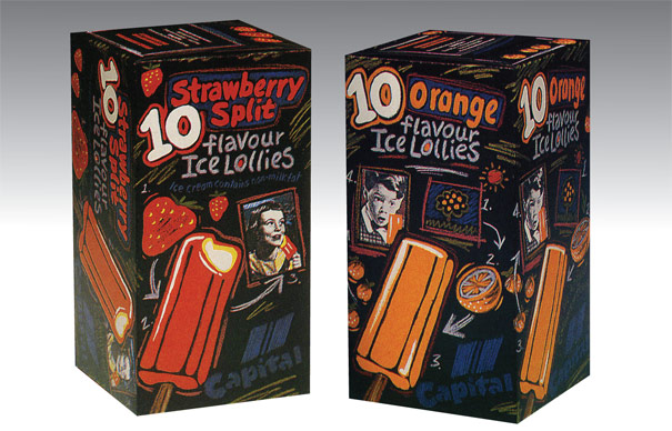
Credit for the salad packs above go to Chris Gallacher for design and to Brian Taylor for illustration. I designed the ice lollies packs, while Brian created the final illustrations. I think I also designed the steak packs – I certainly art directed the photography – but please correct me if I’m wrong, Chris!


Actually, I’ve just recovered my original illustration for the ice lolly pack, shown below, that was presented to the client for approval. This was accepted by David on the proviso that the finished pack was “less busy”. Well, comparing my illustration to Brian’s finished article, I don’t know if it’s any less busy, but it went ahead anyway! The carton had to be designed to sit both upright and on its side, so what you see below are the two faces of the orange lollies that fold down the middle.
