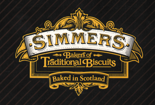
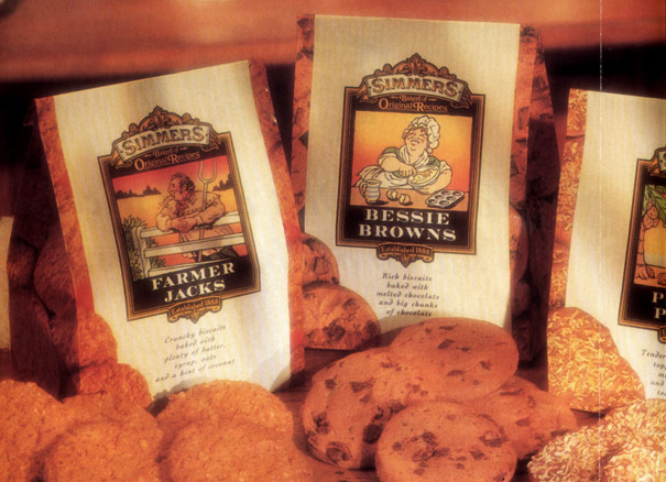
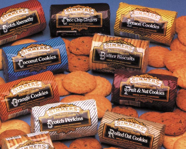
Simmers had been baking quality biscuits for almost a century when, in the early 1980s, they asked us to develop a new identity, new packaging and marketing. I remember developing the logo by cutting out and sticking bits and pieces of decorative flourishes, borders and type together, then retouching the artwork with a fine Rapidograph, to achieve its traditional feel.
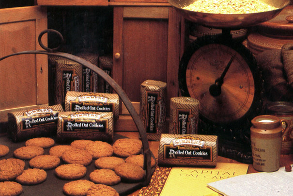
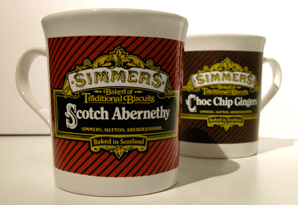
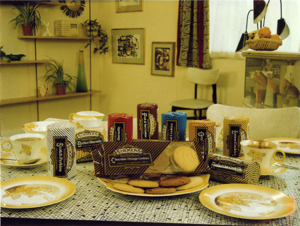
Then we developed the biscuits packaging style – black diagonal stripes on relevant colour backgrounds.
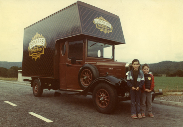
The logo and stripes then appeared on everything! We produced leaflets, brochures, point-of-sale material, promotional items, press and TV advertising, everything. Even Simmers’ lorries were entirely striped. For trade shows and events, they even had a replica van (below) produced in their livery.
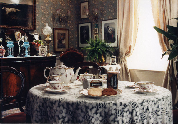
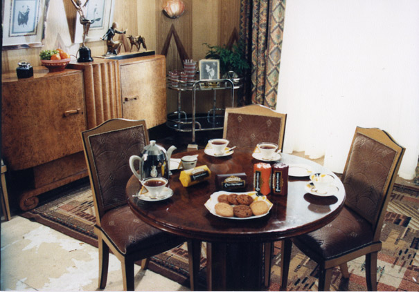
Below are featured three stills from one of our TV adverts for Simmers, showing home settings from the 1900s, 1930s and 1950s, conveying the Simmers’ byline ‘A Century of Excellence’ – similar, in fact, to what Hardy’s wines are doing today! This was one of the few TV adverts that we produced down in London, simply due to easier access to the props we needed. Otherwise, we (or was it I) had an unwritten policy to keep things up in Scotland whenever possible, to keep our own production industry busy (and to save me travelling).
We continued to work on Simmers design and marketing for many years until they were swallowed up by a big Fox.
Nowadays, the logo is still very similar, but has been simplified. Huh, designers!
