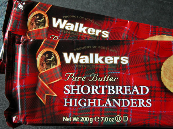
The synonymous red tartan of Walkers was already well known around the world by the time we started working with them in May 1991, but their branding was being inconsistently handled across their wide range of packaging and promotion. The logo could be found in various positions and sizes, in white, red, black or gold, with or without the Bonnie Prince Charlie and Flora Macdonald painting.


To establish one logo that could be used consistently on all types of packaging and across all media, one that was particularly legible on tartan, I combined several of Walkers key selling elements into the identity – the name ‘Walkers’, of course, in white with a strong gold outline; introduced ‘Product of Scotland’ and ‘Established 1898’; and specified the exact relationship between these elements and the ribbon containing the painting. This arrangement also ensured the consistent positioning of the branding at the top left of all Walkers packaging.

In the 15 years of working with Walkers, over 100 different packs and tins were designed to these guidelines, as well as all their corporate brochures, sales material, livery, worldwide airport signage and magazine advertising.
The idea for a Walkers centenary ‘logo’ lay in my top drawer for about six years before I could use it! Their three best selling shortbreads – finger, highlander and round – combined to spell 100. Tasty!
