This was a suggestion for a new product from Scottish Liqueurs.
The brief had been to redesign the label and promotional material for ‘Columba’, an existing product. Their specified target audience was young to middle-aged women. To me, however, the name ‘Columba’ suggested a rather tired product and old-fashioned monks, and I couldn’t see how this could be turned around to appeal to the female market. I felt strongly, therefore, that the name and image had to change.
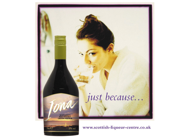
Various alternative names and treatments were considered before settling on ‘Iona’, the name of a small island off the west of Scotland. This had the soft, romantic feel I was after.
In order to add a personal feel to the brand name, I developed the brush handlettering and set this against the escapist imagery of the islands landscape. Several colour alternatives were presented.
Advertising and point-of-sale sell the image of girls enjoying a drink of ’Iona’ any time they want it, “just because” they want it – no other reason.