These ideas on corporate identity and marketing for the City of Inverness were for a pitch in 2003. I produced sketch visuals for numerous alternatives, but colour visuals were only produced to my preferred scheme.
The byline ‘new city, new thinking’ was intended to make its audience revisit and rethink their old views on the town, and review this forward-thinking, new city and its advantages to industry, tourism and modern living.

The logo introduces lively colours and imagery behind the lettering, offering photographs of different aspects of highland city living. In other words, you have to look beyond the name to see the bigger picture.
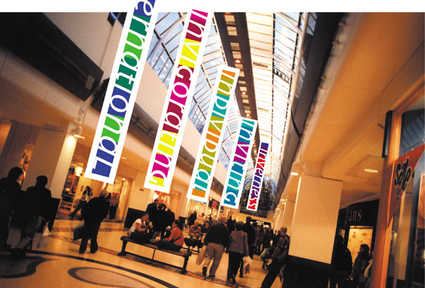
The advertising and merchandising derived from words incorporating parts of the word ‘Inverness’. For example, the shopping centre banners (above) and the t-shirts (below) incorporated words that either started with ‘in-’ or ended with ‘-ness’, allowing the message to be targeted at a wide and disparate audience.

